PocketChange
Problem
Despite the abundance of finance tracking tools, users often feel overwhelmed by cluttered interfaces and confusing features. There’s a need for a simpler, more intuitive solution that empowers users to easily understand and manage their money.
Objectives
To design an intuitive and user-friendly finance tracking app that simplifies budgeting and spending awareness, helping users feel more in control of their finances.
Research
To understand how people currently manage their money, I explored several well known finance tracking apps, including Mint, YNAB, and PocketGuard. I wanted to understand what each app does well and where do users tend to get stuck. What I found was that while these apps offer powerful features, many of them feel overwhelming. Through research into user feedback and app store reviews, I found that many users felt frustrated by complicated interfaces, confusing features, and lack of clear insight into their savings. These insights helped shape the foundation of my app, which focuses on delivering a clean and intuitive interface that supports users without overwhelming them.
Based on my extensive research, the following issues needed to be addressed:
- Overwhelming visuals that make it hard to quickly understand spending.
- Apps felt cluttered or hard to navigate.
- Visuals don’t clearly show where money is going.
- Overuse of technical or financial jargon.
- Charts and graphs are hard to interpret.
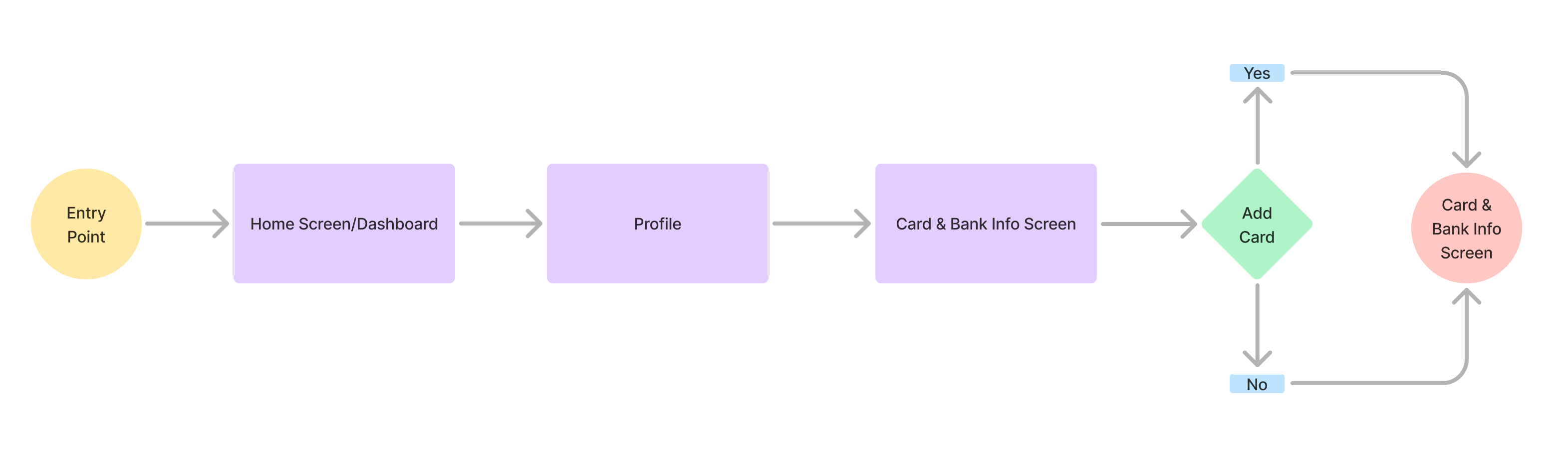
User Flow
I created user flow diagrams to map key interactions and decisions, ensuring efficient navigation and a smooth user journey. This helped streamline the app’s functionality and improve overall usability.
General Overview

Example - Adding a New Card
This flow shows how a user can add a new card to their profile. It walks through entering the card details, checking everything over, and saving the card. The goal was to make the process simple and easy to follow from start to finish.
Mid Fidelity Wireframes
At the mid-fidelity stage, I translated early sketches and concepts into more defined wireframes. These screens prioritized user flow, spacing, and interactive elements, laying the groundwork for a more polished and intuitive experience in the high-fidelity phase.


User Prototype Testing
To validate design decisions early, I created interactive prototypes in Figma and conducted user testing to gather feedback. This process helped identify usability issues, improve the overall user experience, and ensure the product aligned with real user needs before handing off to development.

Launch Figma Prototype
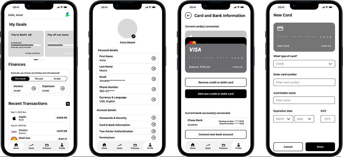
High-Fidelity Screens
The high-fidelity designs showcase the final look and feel of the mobile app, complete with visual styling, typography, color, and interaction details. These screens bring the full experience to life and represent the final stage before development.
High-Fidelity Screens


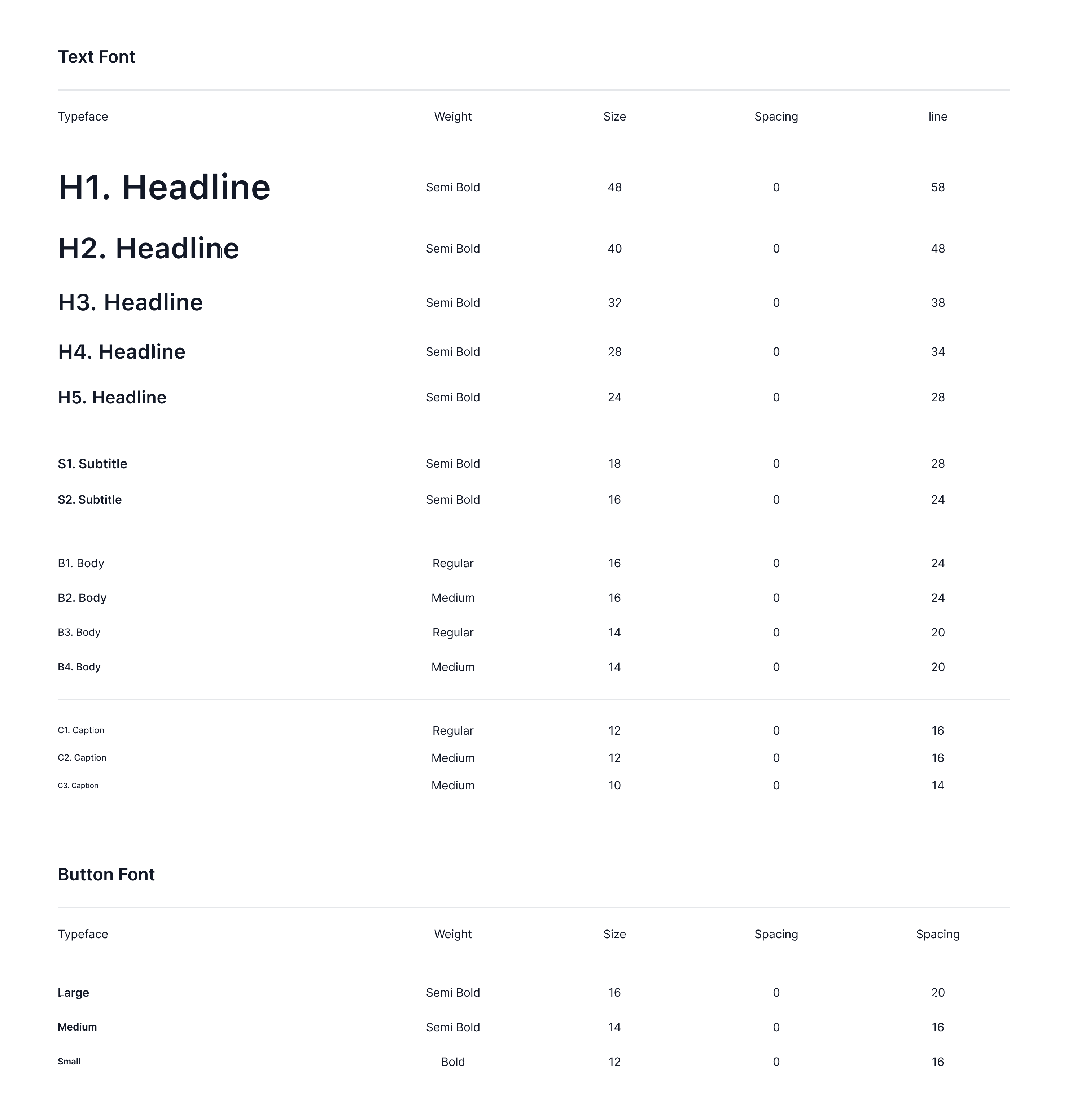
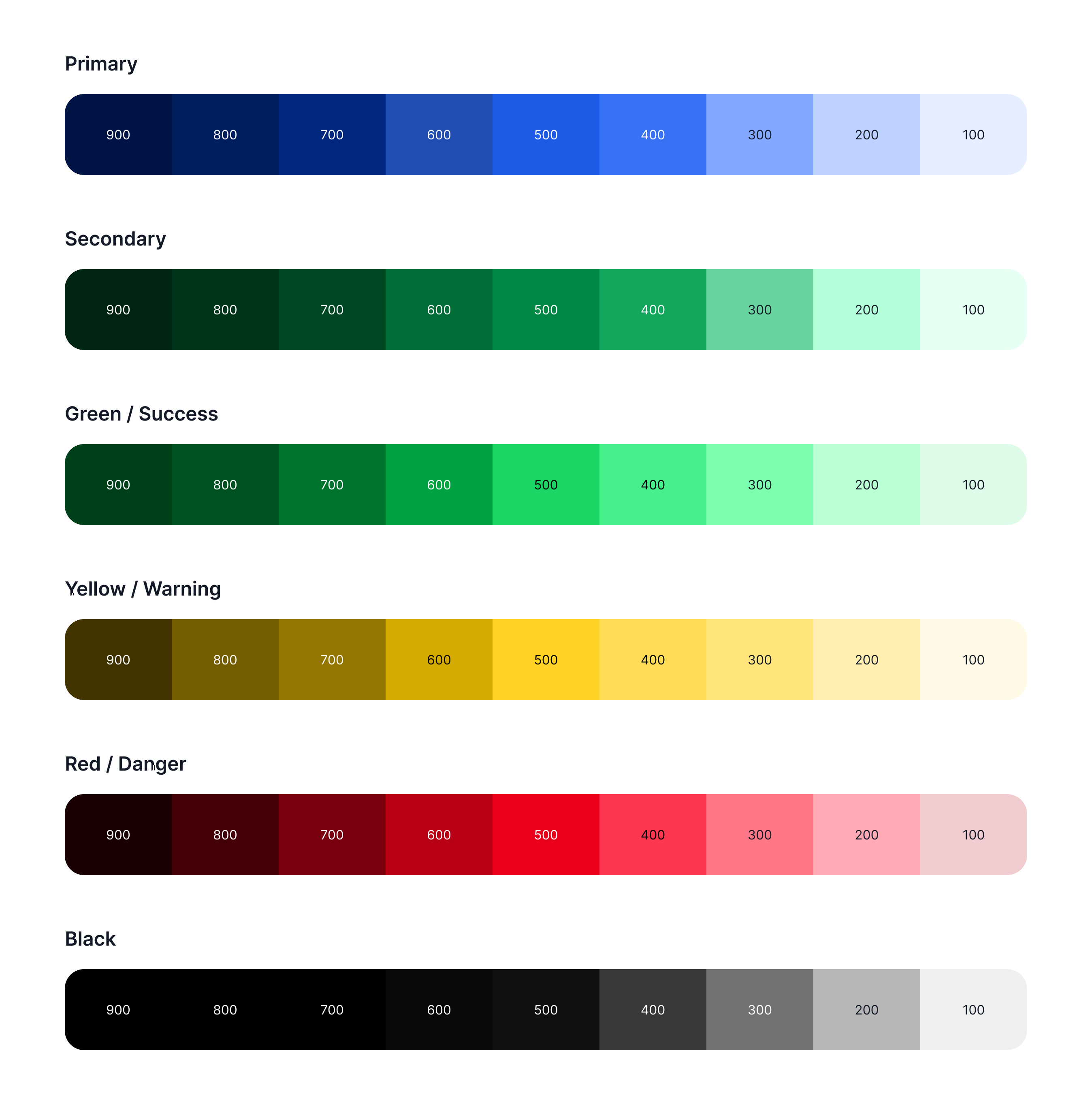
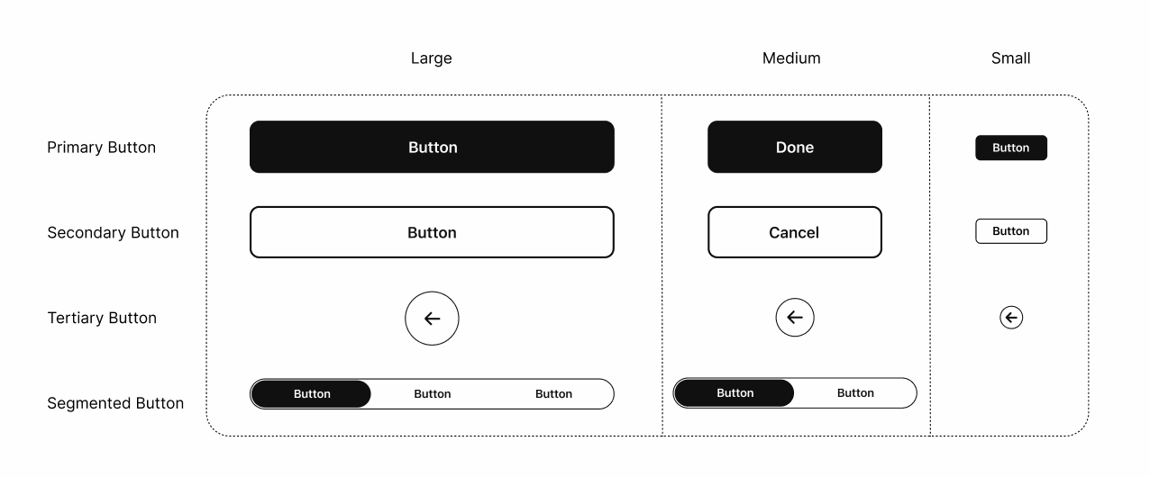
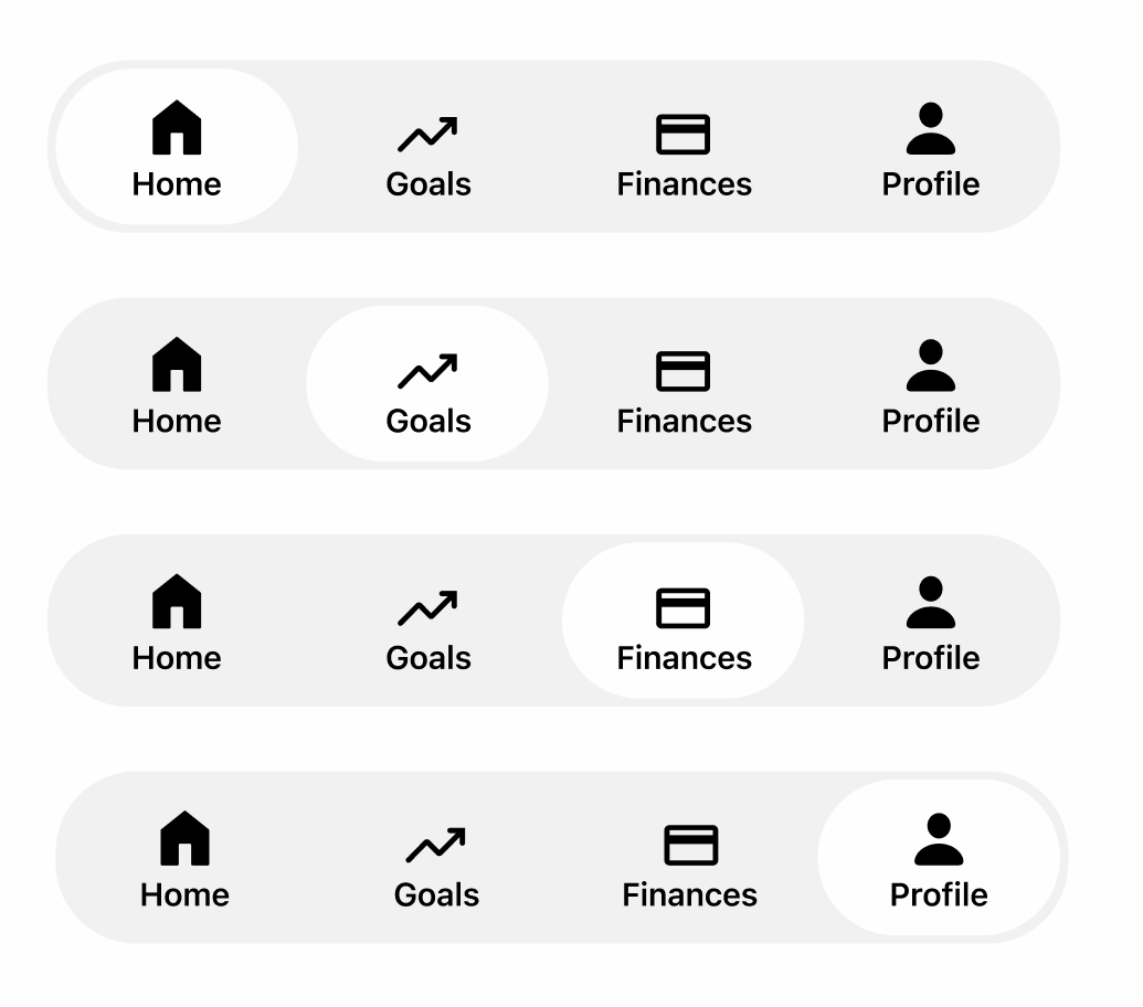
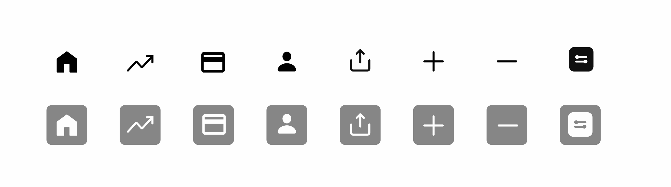
Design System & Component Library
This section showcases the core building blocks of the product’s visual identity. From typography and color to commonly used UI elements, these components promote consistency, scalability, and a cohesive user experience across the interface.
Typography - SF Pro
Color Palette
Buttons
Bottom Nav Bar
Iconography
* Gray background on selected icons is to display a white icon