About FREEZE
The winter sports industry is a thriving, passionate community made up of millions of people who rely on accurate weather data for both work and recreation. With numerous apps like Apple Weather, the National Weather Service, and OnTheSnow offering forecasts, inconsistencies between platforms can lead to confusion and uncertainty for users trying to make informed decisions.
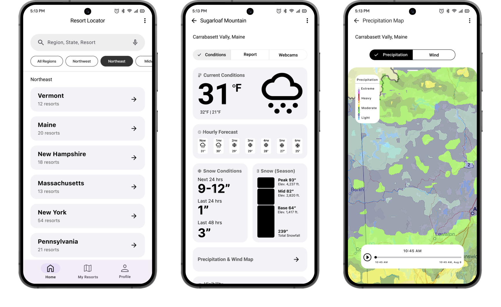
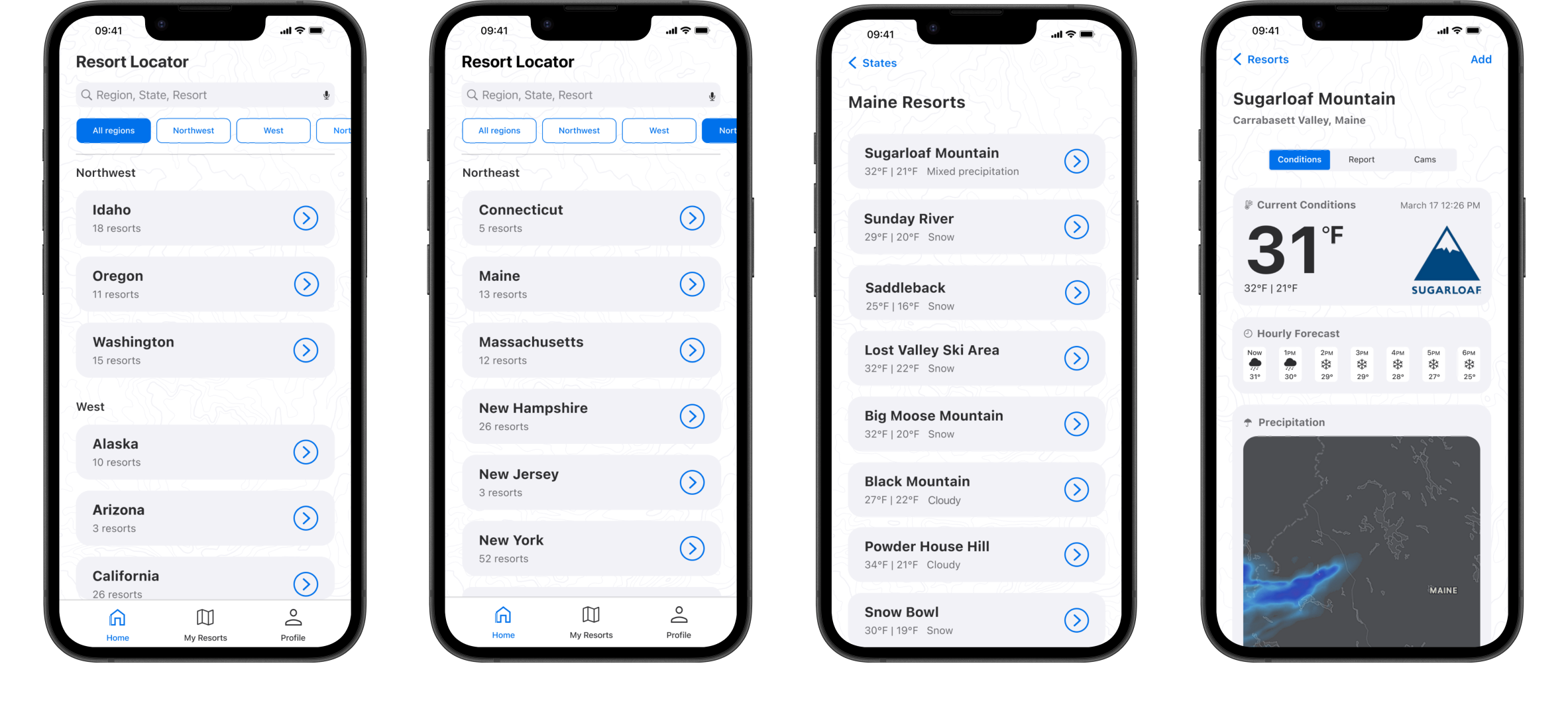
FREEZE provides users with a comprehensive ski weather application that gathers data from multiple trusted sources into one easy-to-use platform. It offers real-time weather updates, snow conditions, and interactive mountain maps to help users make informed decisions on the mountain.
Problem
Skiers and snowboarders often face inconsistent and unreliable weather forecasts across different apps. This project aims to solve that problem by creating a comprehensive ski weather app that delivers accurate, consistent, and easy-to-understand forecasts from multiple trusted sources in one place.
Objectives
To design a user-friendly ski weather app that consolidates data from multiple sources to provide reliable, real-time forecasts and snow conditions, helping users make informed decisions on the mountain.
Research
I conducted research to better understand how users interact with other weather apps and the challenges they face. I analyzed popular apps like Apple Weather, OnTheSnow, and The National Weather Service, identifying common issues such as inconsistent forecasts, confusing interfaces, and scattered information. I also gathered user feedback through surveys and reviews, which highlighted frustrations with unreliable data and difficulty quickly finding relevant information. These insights guided the focus of the app toward providing a reliable, consolidated, and easy-to-navigate platform that meets the specific needs of ski enthusiasts.
Based on my extensive research, the following issues needed to be addressed:
- Overwhelming visuals that make it hard to quickly understand current conditions.
- Cluttered or confusing interfaces that make navigation difficult.
- Poor presentation of snow conditions and ski-specific weather details.
- Scattered data requiring users to check pages/tabs for full details.
- Charts and graphs are hard to interpret.
Design Process
1
Research
Project Goals & Objectives:
Reviewed other weather apps to identify gaps in features and design, aiming to provide a unique experience.
Competitor Analysis:
Defined clear goals to create an app that offers accurate, real-time weather data for skiers and snowboarders.
User Research:
Conducted interviews with target users (skiers and snowboarders) to understand their pain points and needs.
2
UX Design
Gather Inspiration:
Explored outdoor and weather-related apps for inspiration, focusing on clean, intuitive design.
Wireframing:
Created low-fidelity wireframes to define the app structure and user flow, focusing on key features like search and filtering.
3
User Testing
Rapid Prototyping:
Developed an interactive prototype to test core app functions like account creation and resort search, gathering initial feedback.
User Testing Continued:
Tested with a broader user group to refine visual elements and interactions for a smoother user experience.
4
UI Design
UI Concept:
Converted wireframes into mid/high-fidelity mockups, maintaining platform consistency with modern design aesthetics.
Visual Design:
Defined color palette, typography, and component library.
5
User Testing Continued
User Testing:
Tested the high-fidelity prototype, focusing on UI details like color contrast and button placement to ensure usability and accessibility.
6
Analysis & Handoff
Feedback Analysis:
Looked over user feedback and performance data to find issues and make improvements before handing off the app.
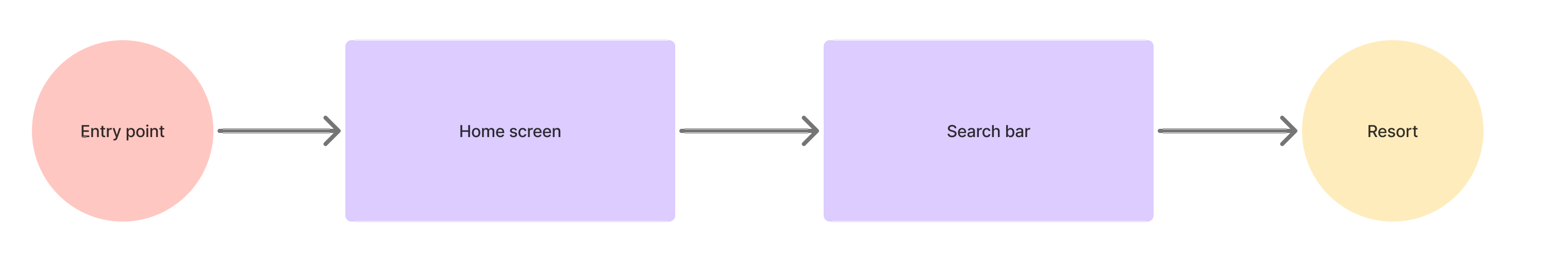
User Flows
Example User Flow - Search For Resort
Mid-Fidelity Wireframes
Each set of screens were designed to follow either iOS Human Interface Guidelines or M3 Material guidelines. Native design patterns were used to allow for a seamless fit for each platform.
iOS Screens
Android Screens
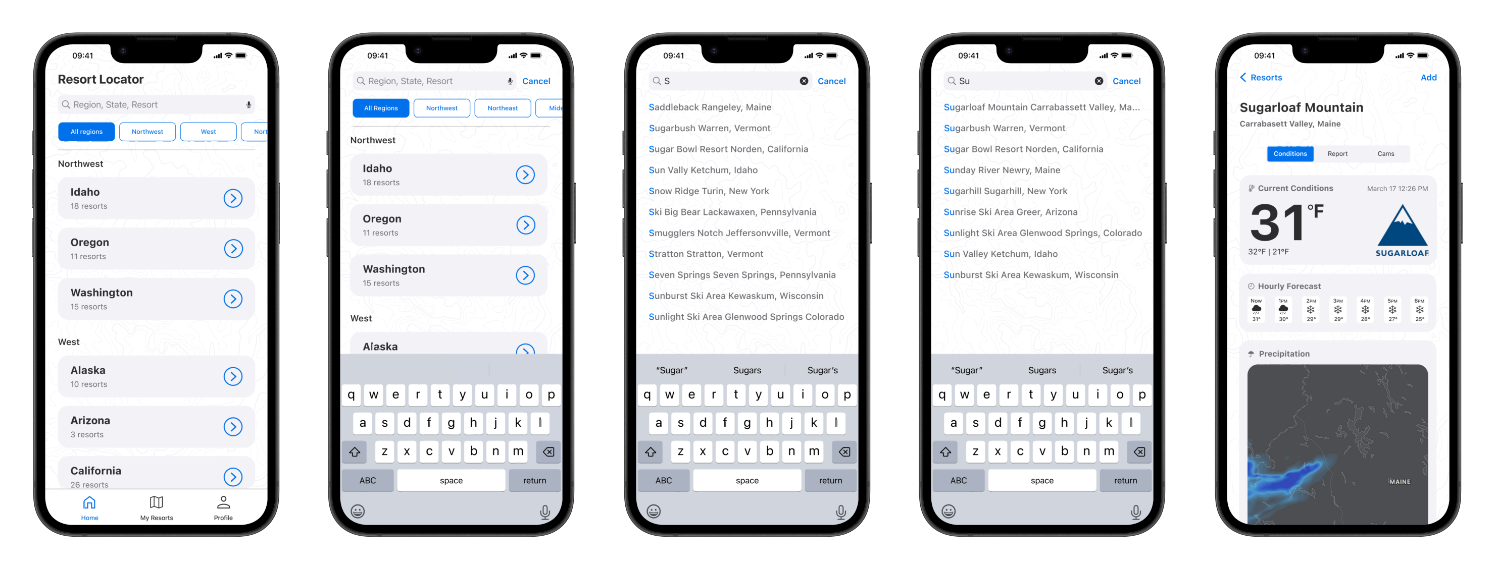
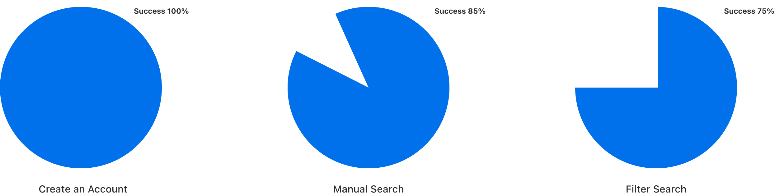
Rapid Prototype Testing
To validate design decisions early, I created interactive prototypes in Figma and conducted user testing to gather feedback. This process helped identify usability issues, improve the overall user experience, and ensure the product aligned with real user needs before handing off to development.
Results
Users were asked to complete tasks such as creating an account, searching for a resort, and using the primary filter system to locate Sugarloaf Mountain.
Search Screens Tested
 Launch Figma Prototype
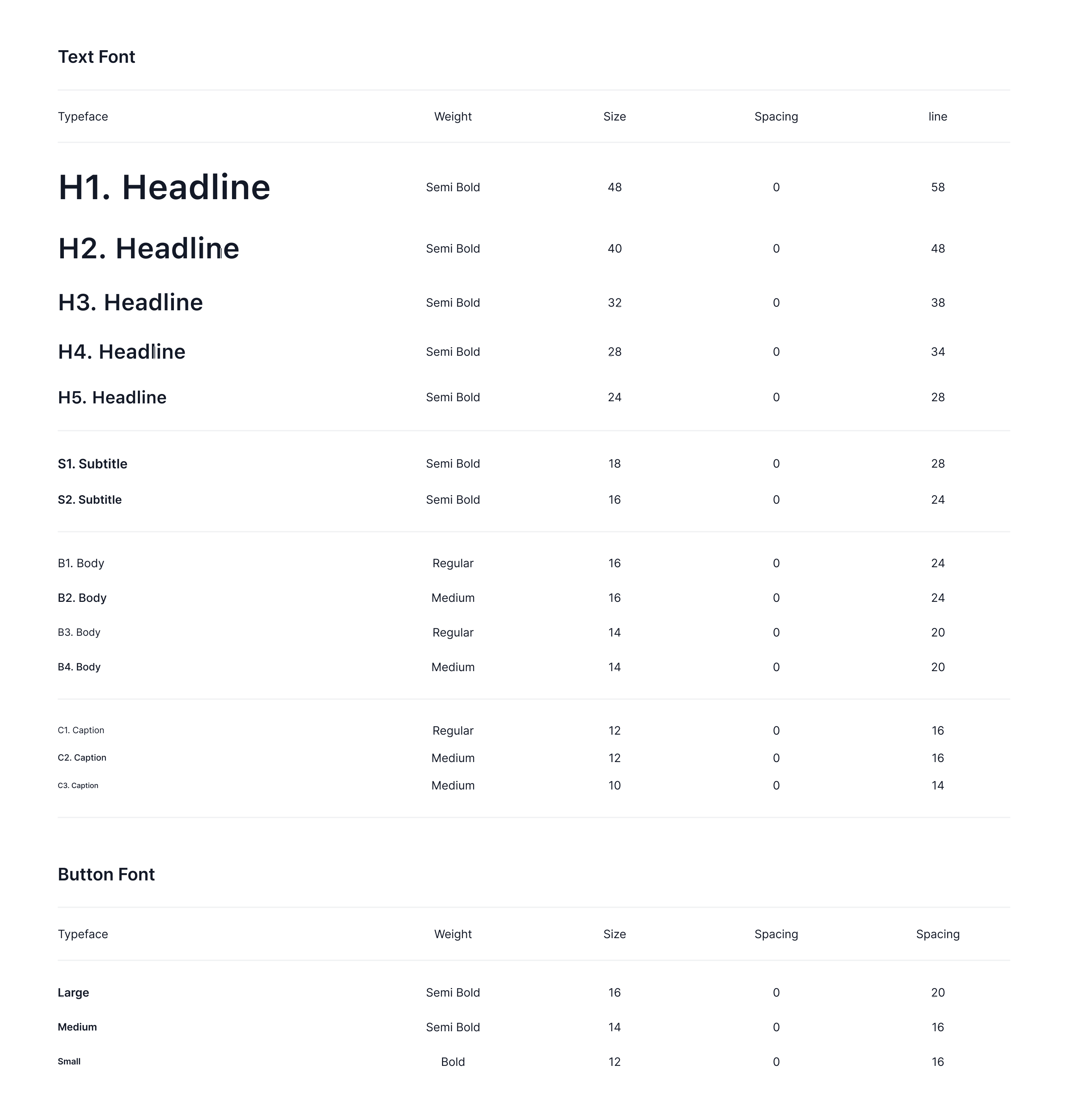
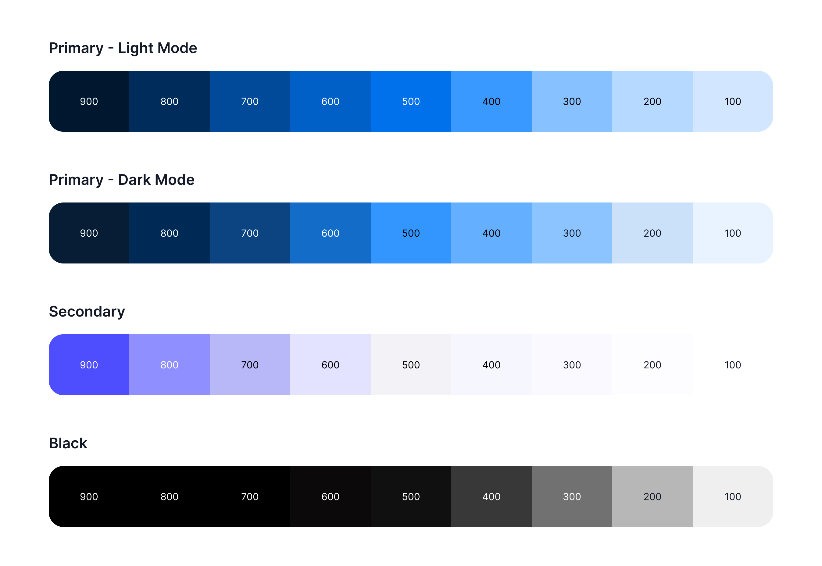
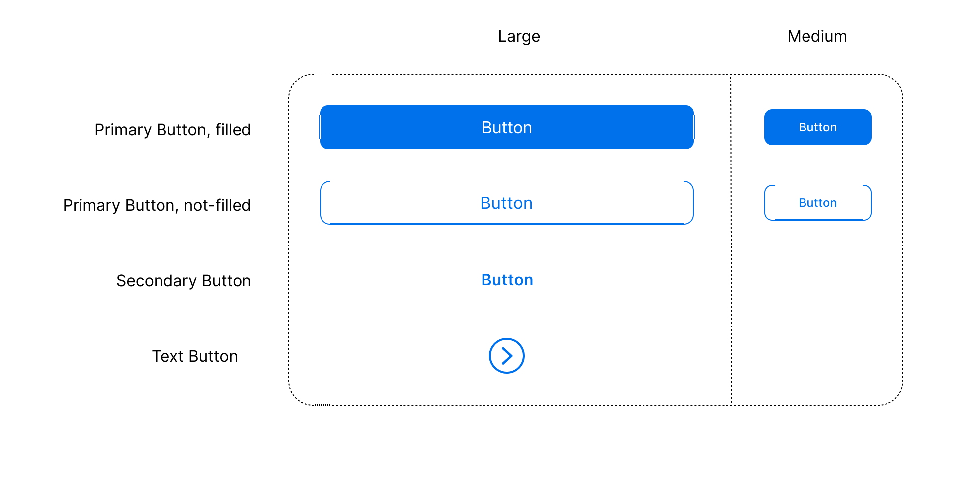
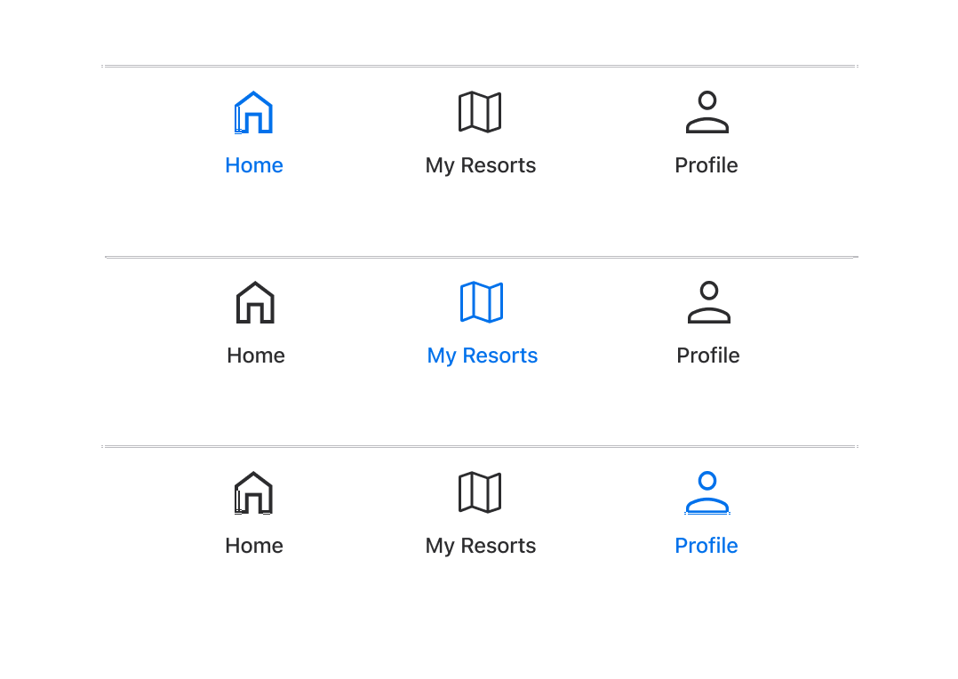
Design System - Component Library
Typography - SF Pro
Color Palette
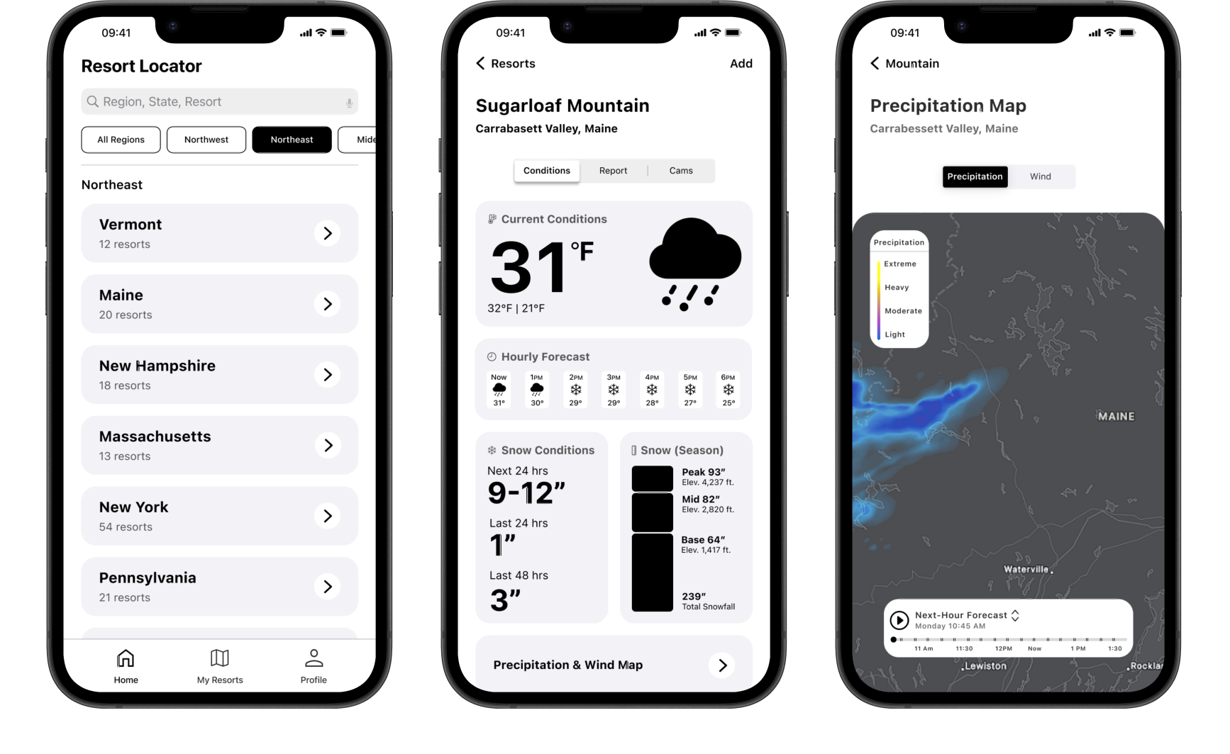
Color adjustments were made in dark mode to ensure sufficient contrast and maintain compliance with WCAG accessibility guidelines.
A unique topographical map inspired background.

Buttons
Navigation Bar
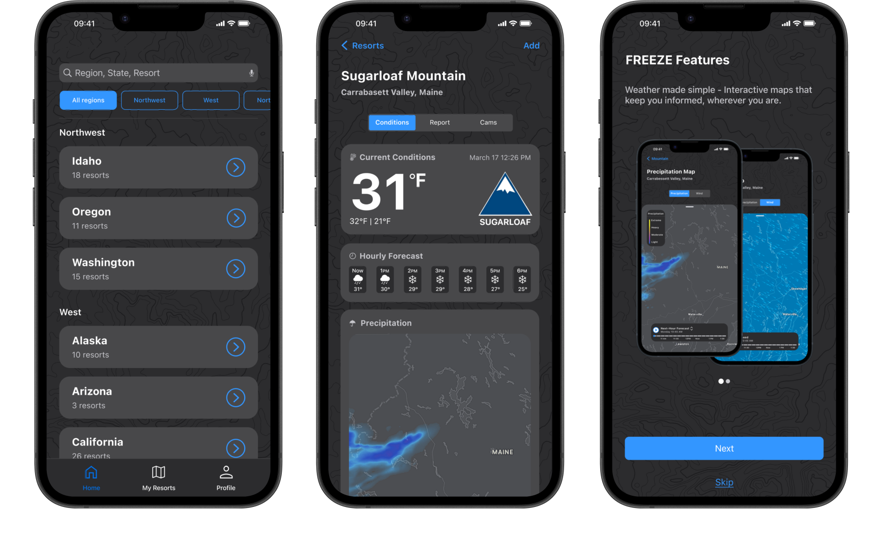
Dark Mode
I added dark mode to improve accessibility for users in low-light environments and ensure better visual comfort and readability.